Friday 15 June 2012

Andrea Vail

Andrea Vail


Gained (LOST) Opportunity, 2010.

The thing I like about this work is the fact that the keys represent that trust people have in each other. The key opens a lot of things from doors to hears, and if you have lost your key, your dead. To me the circle represents life, how it starts and ends, ashes to ashes, life is a circle. The way it is set up with  the bull dog clips gives it a creative look. It could represent the stuggle of life to "open doors to the future", to get somewhere in life.

Rayna Gillman

AHHHH!!!!!!!


Kaddish.

I really like Rayna Gillman's work because the illustration elemement combinded with memories is touching. The writting around the photo, the way the writting is in italics makes me think of old letters, from the war. The photo of the lady reminds me of the photos my Gran has of her mother and father.


Momento
The black and white section reminds me of planes from the war. The italics of the writting also reminds me of old letters from families.

Jody Oesterreicher


Jody Oesterreicher


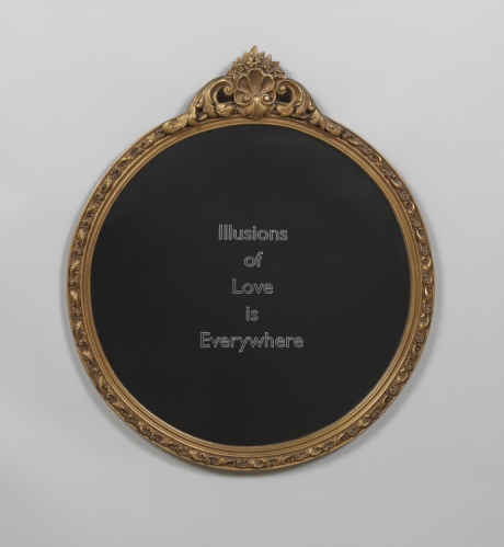
Eternal Oppositional Whole--Machine-etched found mirror
Eternal Oppositional Whole–Machine-etched found mirror

This reminds me of the mirror from "Snow White" (and the mirror of Eristed from 'Harry Potter'). The thing I like about this is that everyone has a different idea of 'Love' dependign on their views and intrests. The mirror is a decrative mirror, this could represent the meanings of love is ancient. The words "Illustrations of Love is everywhere" reminds me of the quote "Dreams are illustrations from the book your soul is writing about you." — Marsha Norman : ) it reminds me that we all have different ways of looking at the same thing.
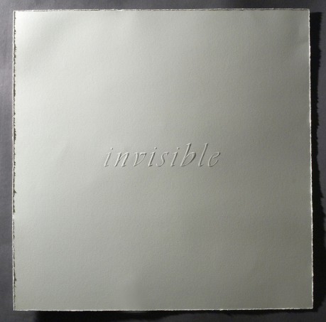
Invisible--Hand-embossed paper
Invisible-Hand-Embossed paper

The thing I like about her work is the idea behind it, to me taken from childhood stories or books. The "invisible" page reminds me of "Harry Potter" because of the "invisible" reminds me of the invisible ink that is used in 'Tom Riddles' diary and the map. The writting is not noticable at first glance but when you get close you relise what it is. This idea is interesting because when we are focused on "the bigger picture" we forget what is close to our face. It reminds me to take time to "smell the roses".

Wednesday 13 June 2012

Barbara W Watler

BARBARA W WATLER


I am choosing to look at "old" as my topic area, and in doing so I have stumbled accorss Barbara W Watler's and her fingerprint work. the reason why I like this work is because we forget that we all have a unique one, and knowing about it is an "old" thing. I found her work from http://thetextileblog.blogspot.co.uk/2010/07/barbara-w-walter-and-fingerprint.html and it is incredibly exciting. the reason for this is because we tend to over look the smallist details, like the fingerprint.
(The blue one is called Fingerprint series #50: Unity.)
(The one below is called Fingerprint Series #46: Vortex.) The different sections together form the image of the fingerprint, the shades created give it form, the arches of the lines remind me of waves. The darked sections of the black remind me of police films when they take the fingerprint and they had to much ink and force behind it when it was printed. The main thing I like about this is the fact that no two are a like.